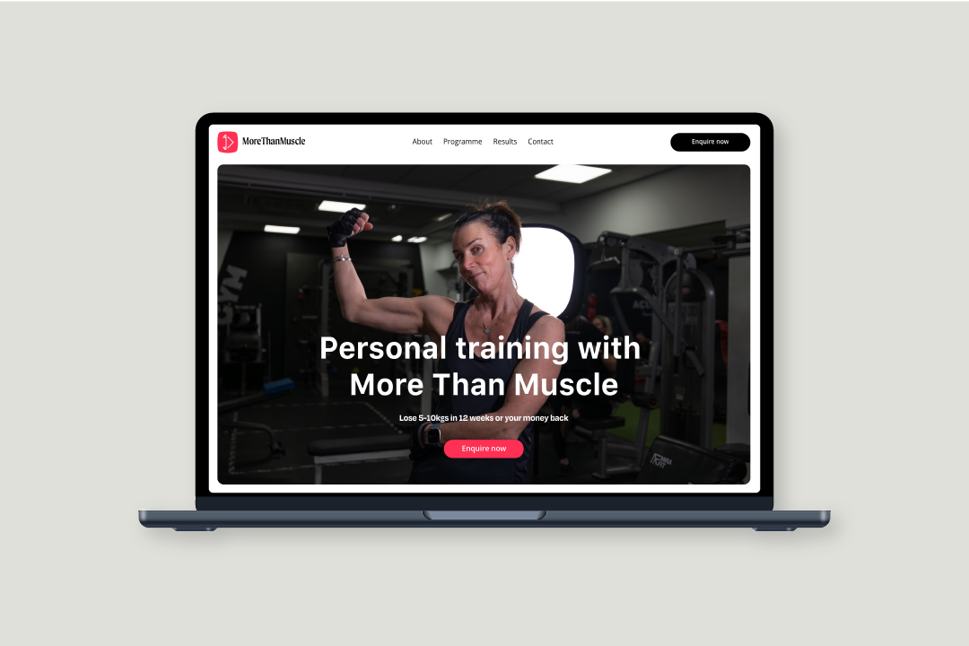
More Than Muscle
A brand built for belief, not bravado.


The problem?
5,000 visitors. Zero conversions,
The outcome?
10 new clients at £2,600 each in the first week, a £26,000 return.
What made it work?
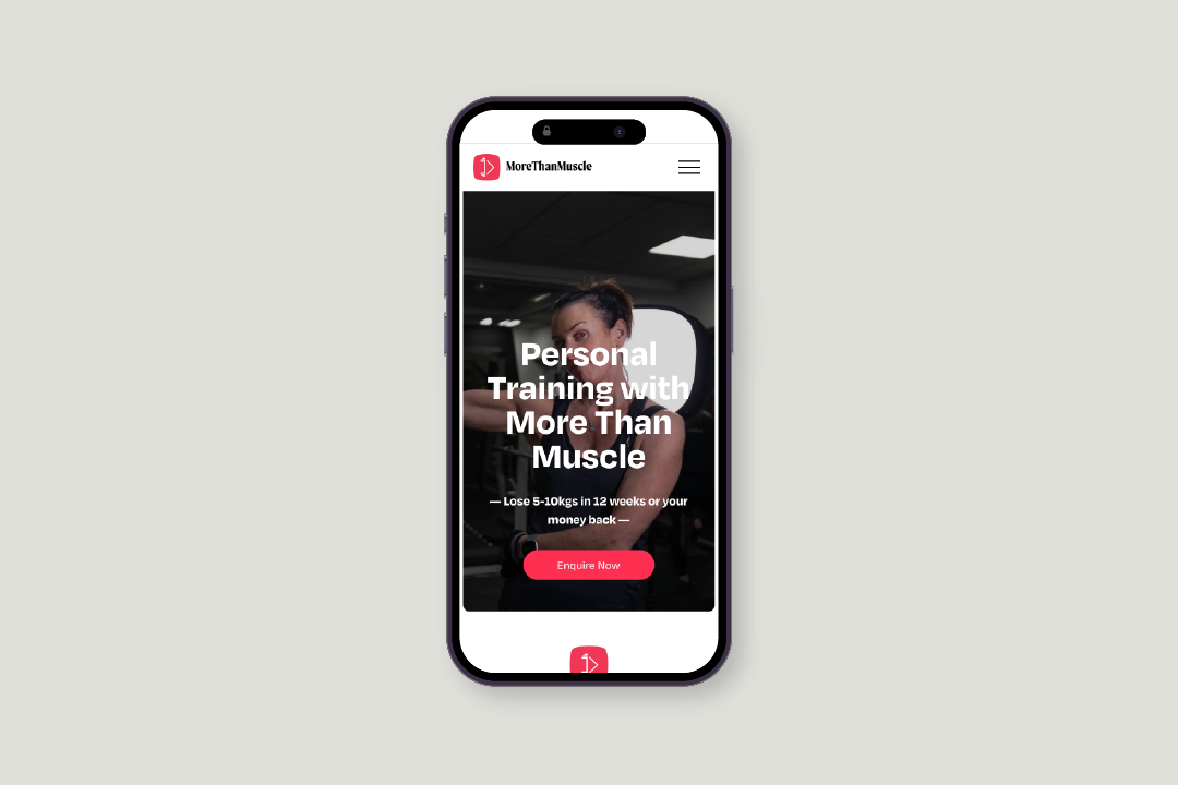
A strategically targeted website, built to convert.
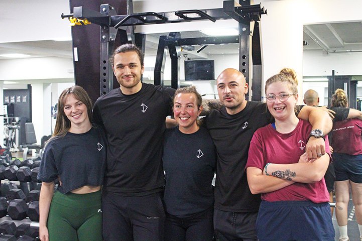
Nat, Andy and the team threw everything they had at it, and it paid off.
More Than Muscle
I first met George, COO of More Than Muscle, at a networking event. His team had recently won Best Personal Trainers, and six months earlier had launched a new website to match their growing reputation.
The problem? 5,000 visitors. Zero conversions.
We met up with George and the founders, Nat and Andy, to get to the heart of it: what they stood for, what their audience cared about, and why the site wasn’t working. The answer was clear, the messaging was off, the site wasn’t built to convert, and they were leaking revenue.
We recommended a fast-turnaround, high-impact site to stop the bleeding, with deeper brand work to follow.
The MTM team threw themselves into the project: George wrote the copy, Nat’s brother handled photography, and a friend built the site using our detailed wireframes and design system.
Eight weeks after that first coffee, their new site launched.
In the first week alone, they signed 10 new clients at £2,600 each: a £26,000 return.