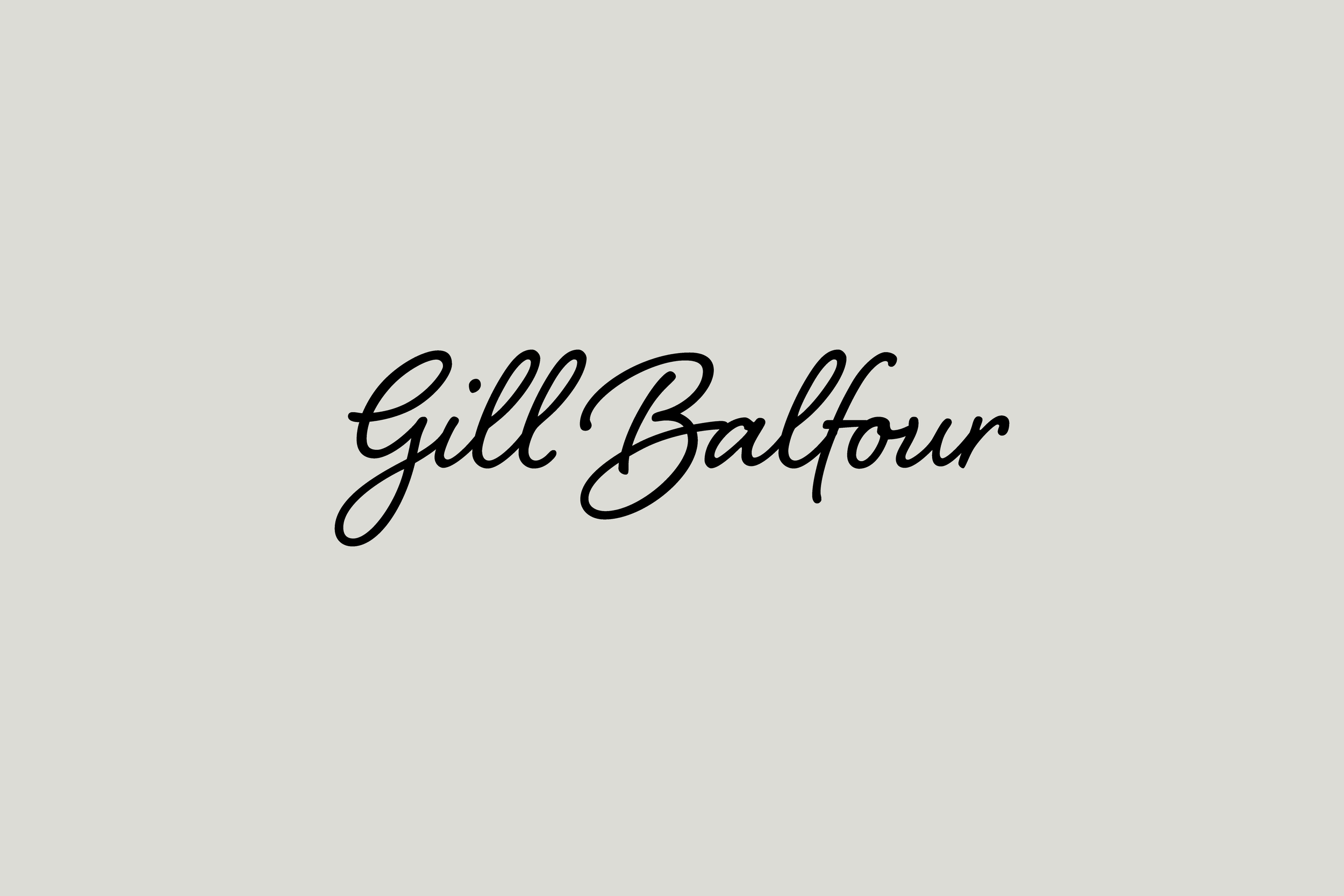
Gill Balfour
A calm, considered brand for a first step into ecommerce.
The problem?
A first-time seller with beautiful work, but no brand, no site, and no ecommerce experience.
The solution?
A calm, crafted identity and a simple, elegant Squarespace site Gill could manage herself.
The outcome?
A warm, distinctive online presence that feels like stepping into her studio; and invites others to do the same.
Gill Balfour
A calm, crafted brand for a first online venture.
Gill Balfour, a retired nurse with a background in design and a passion for ceramics, approached us with a simple goal: to start selling her work online.
She had no ecommerce experience; just a portfolio of beautiful, characterful ceramics and a deep desire to do things properly. What she needed wasn’t just a website — it was a brand that reflected the care, authenticity and tactile nature of her craft.
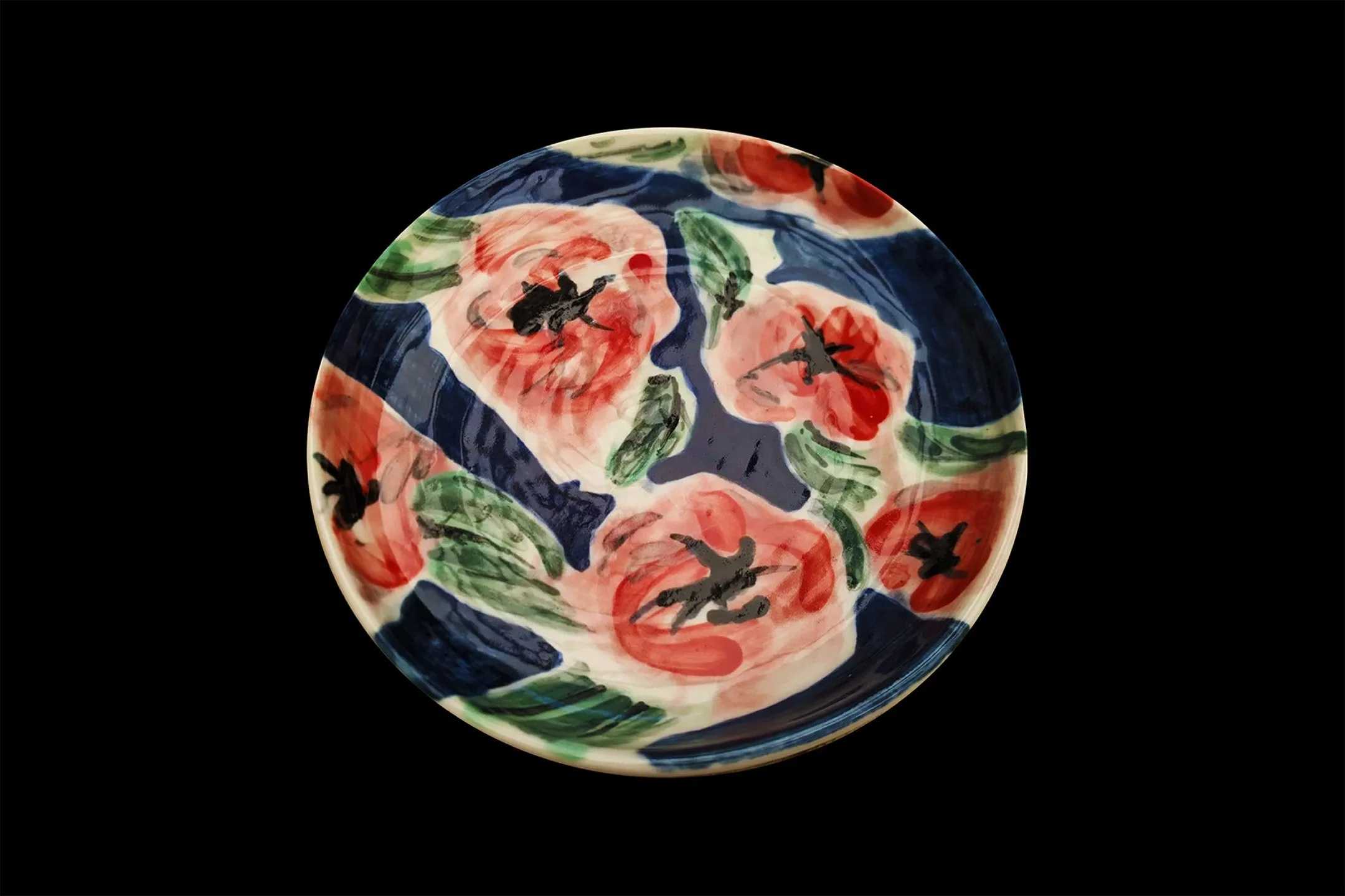
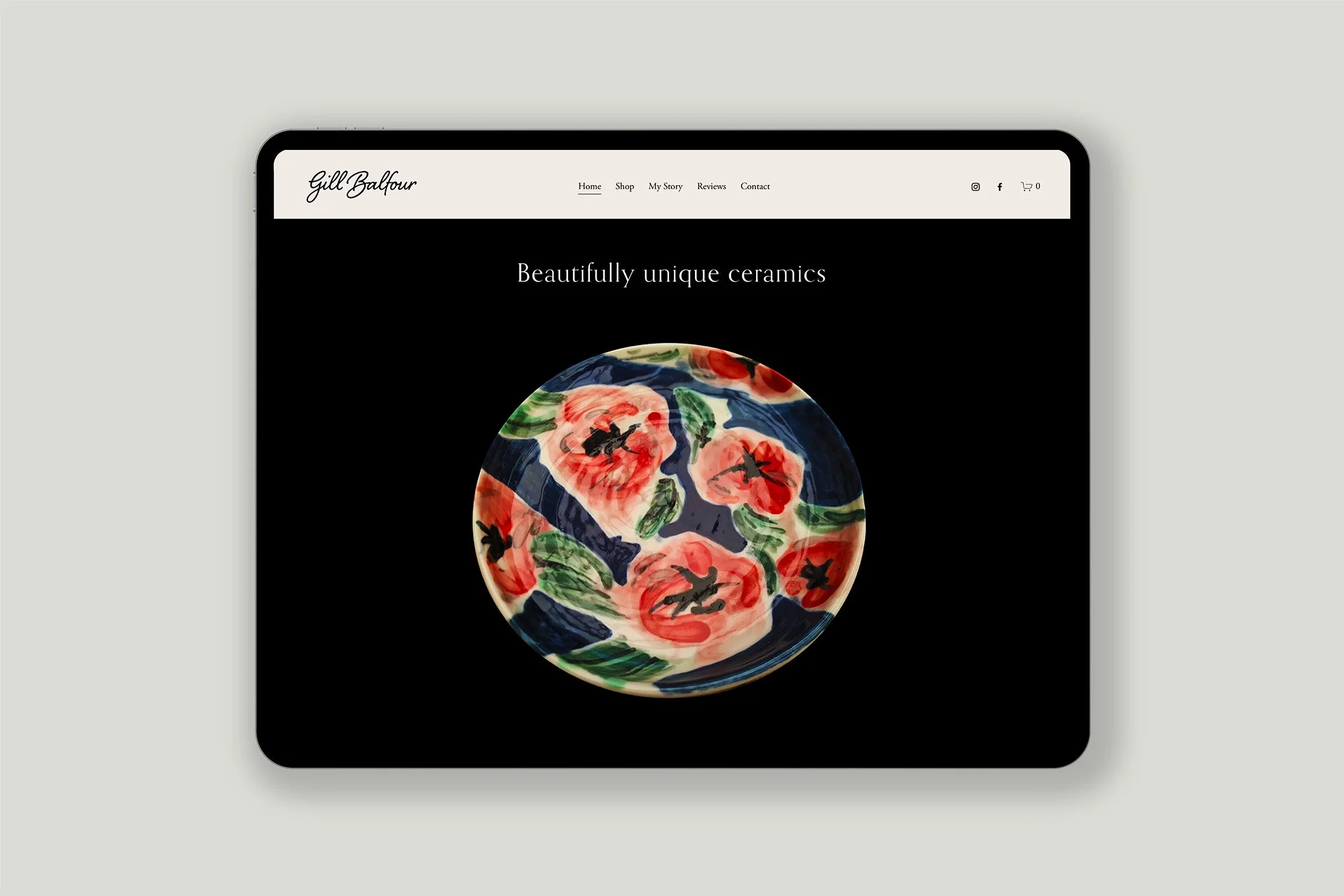
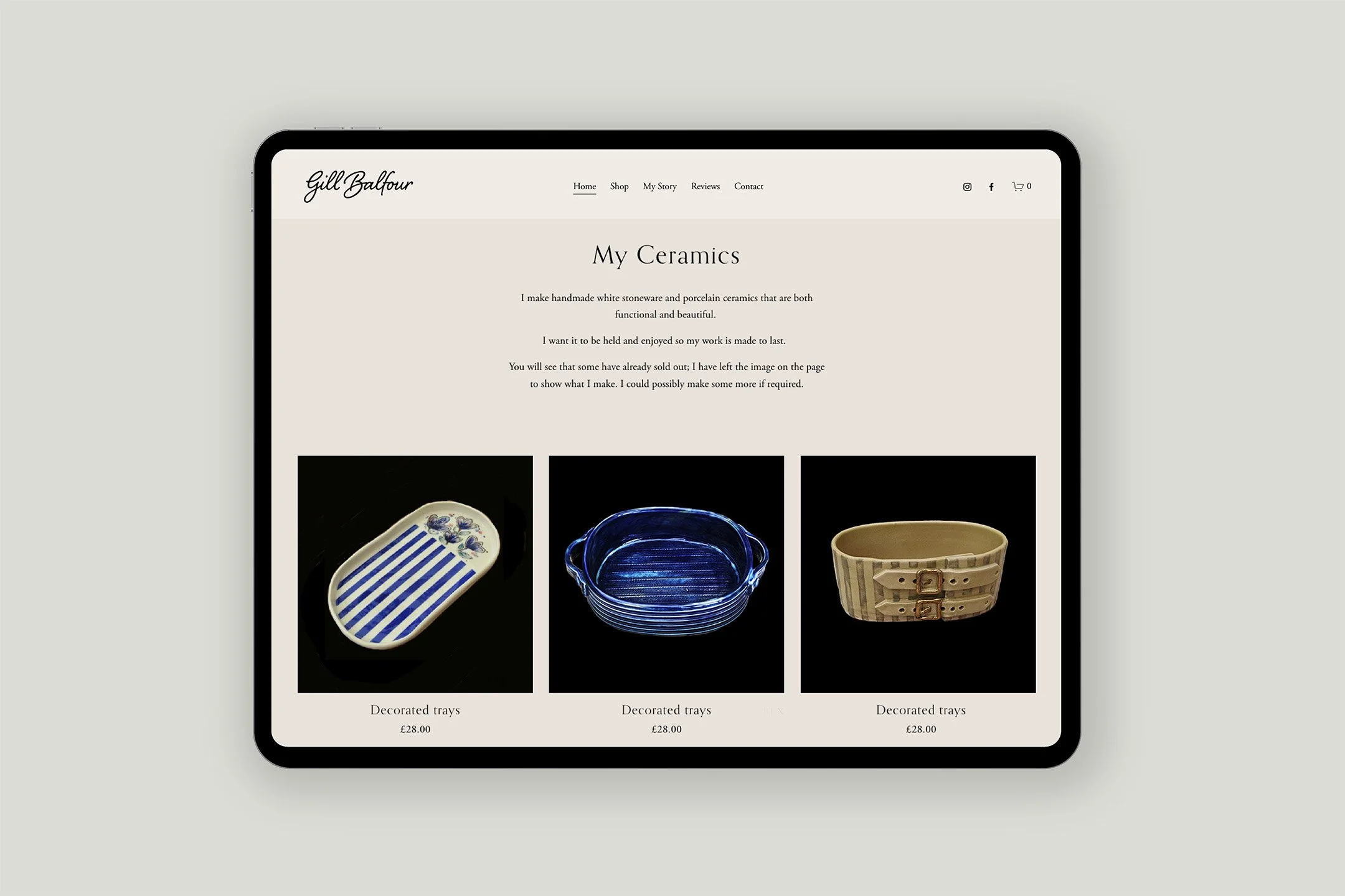
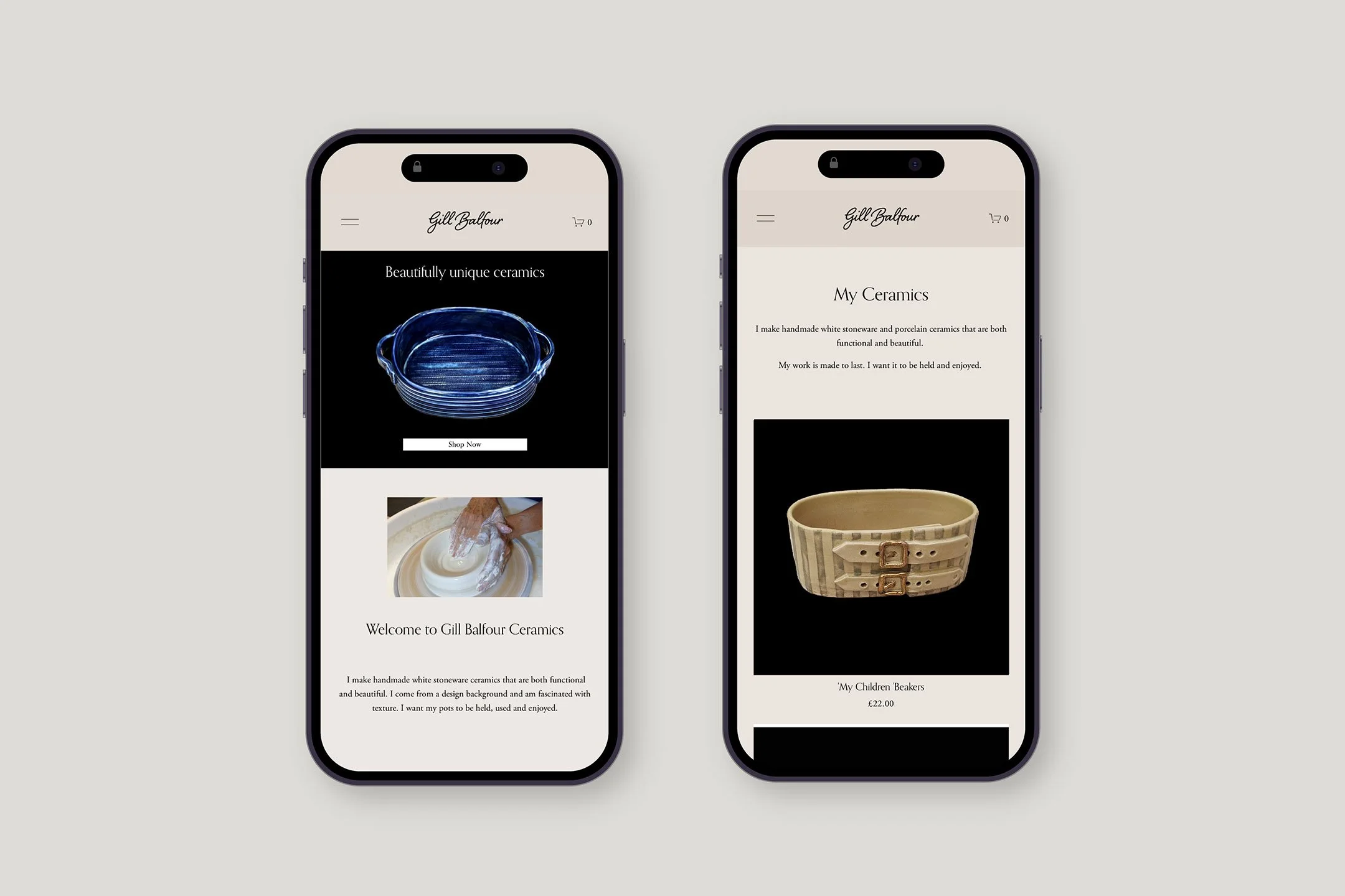
We began by refining her imagery, standardising everything on a rich black background to bring clarity, mood and focus to her pieces. We paired this with a soft, minimalist identity: warm greys, a classic serif typeface, and plenty of breathing space; visually echoing her quiet studio setting.
Using Squarespace as a base, we designed and built a clean, intuitive site that’s simple to manage and future-proofed for growth. It’s not just a shop; it’s a gentle, elegant invitation into Gill’s world.
The result is an online presence that’s thoughtful, distinctive, and entirely her own.
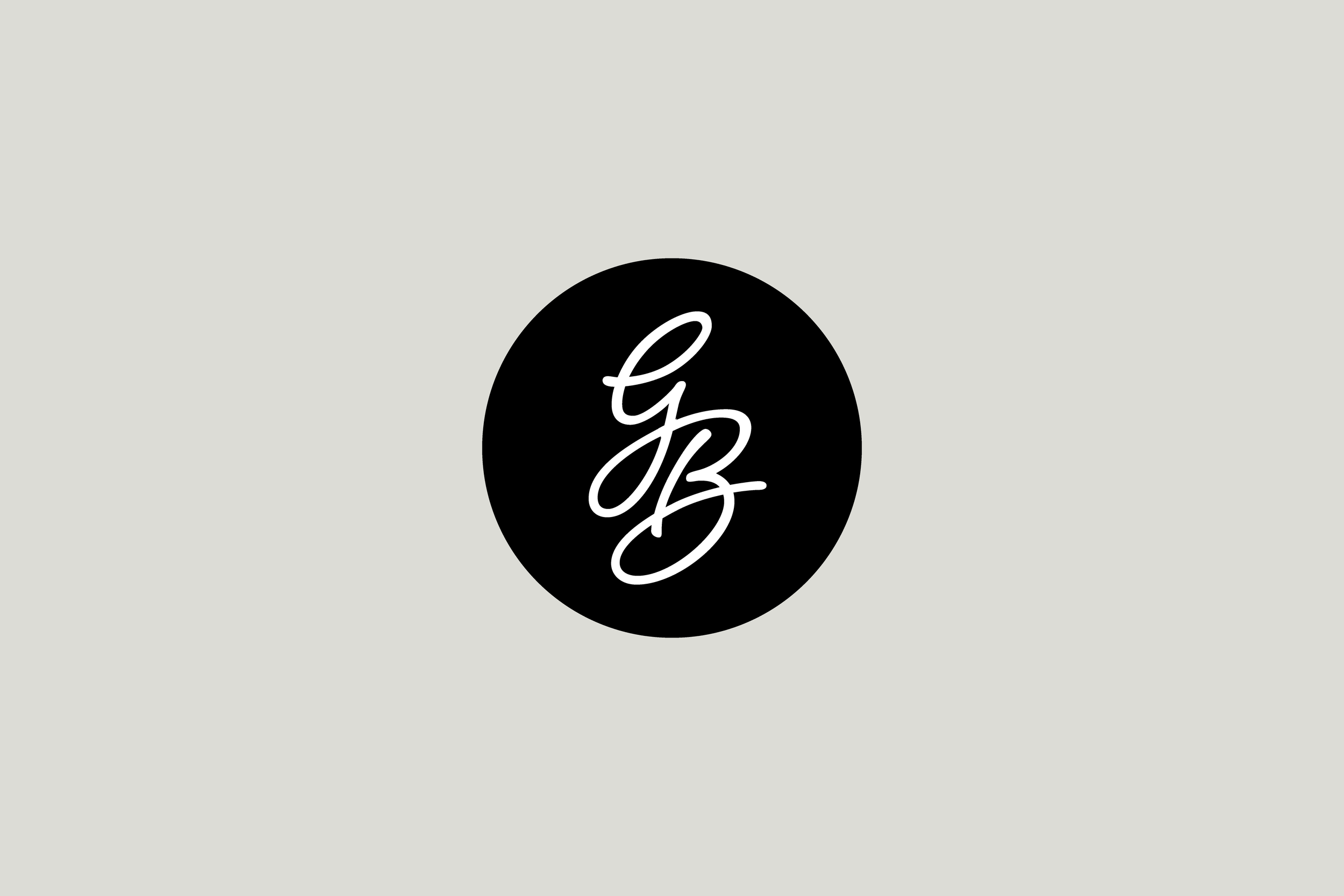
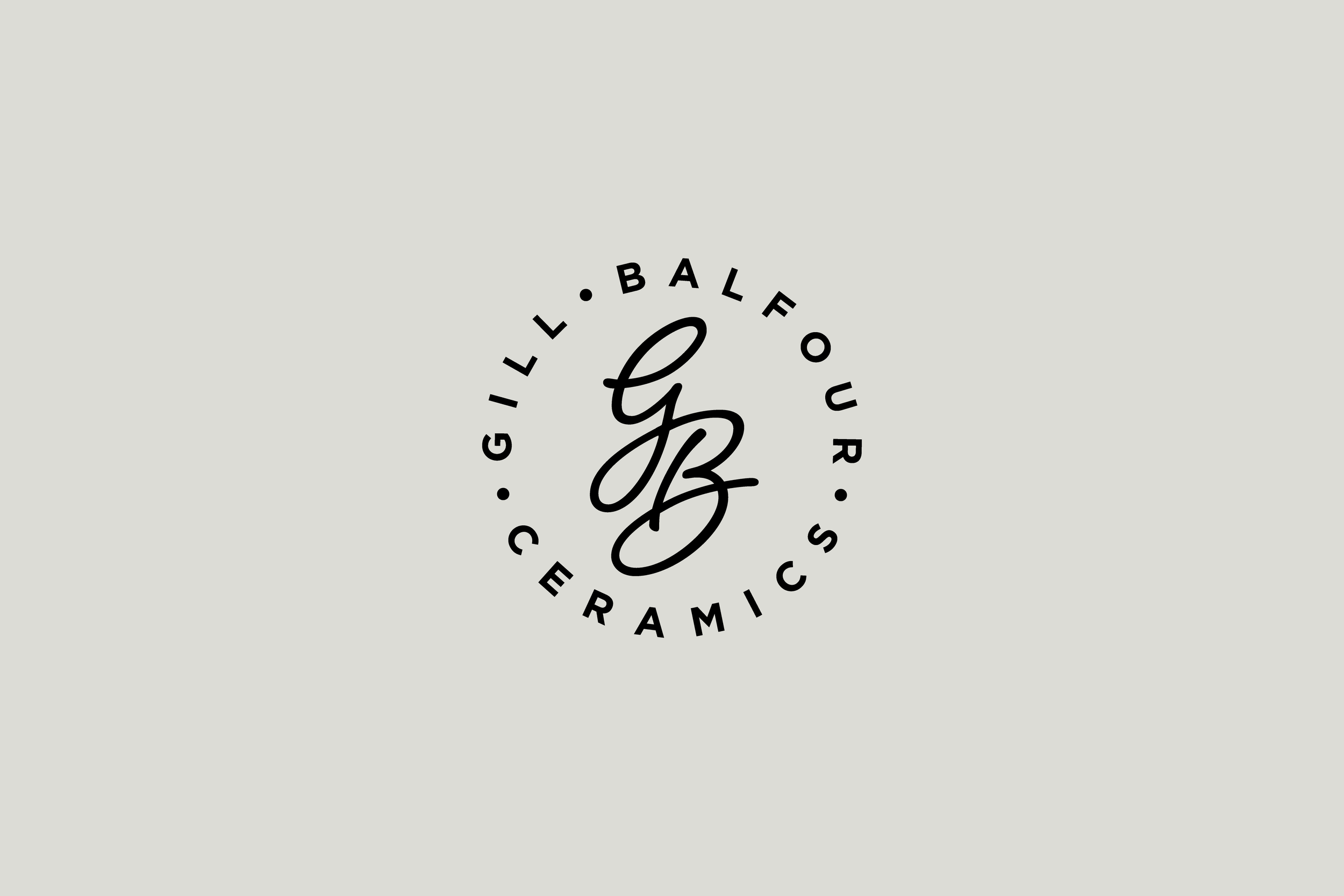
The monogram
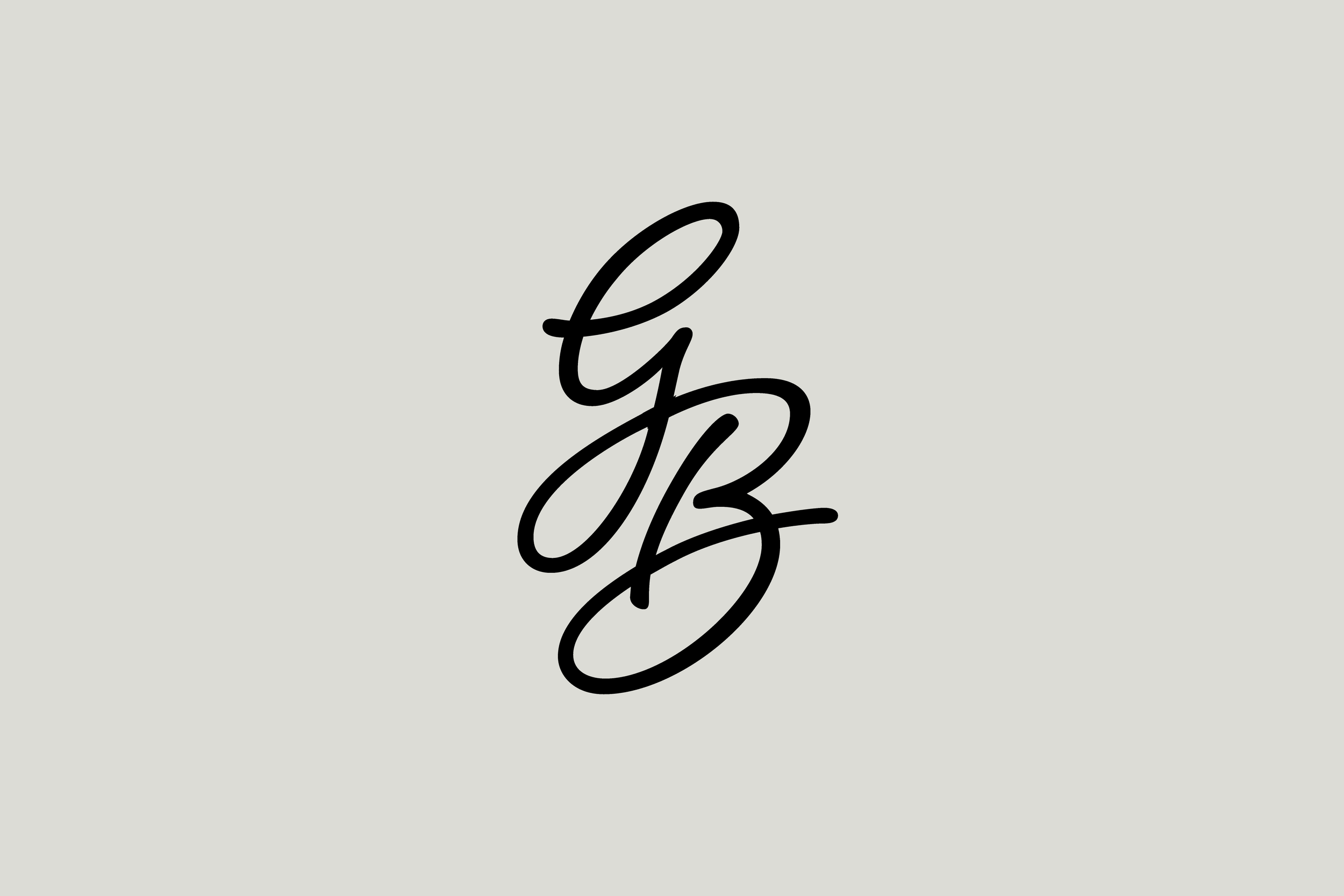
Of all the brandmarks I’ve created, and there have been a few, this may be my favourite.
The Gill Balfour monogram is a small typographic joy. Elegant and perfectly balanced, it reflects the nature of Gill’s work while offering something distinctive and memorable.
What makes it special? Start at the tip of the G and follow the line. It flows gracefully, looping and folding into the B with a pleasing sense of rhythm. The upper loop of the G and the lower bowl of the B echo each other; like two halves of the same thought. The shapes are soft and fluid, yet purposeful. There’s tension and release. A beginning and an end.
As a form, it’s unusual, but not obscure. It’s a squiggle with clarity. Instantly recognisable. Friendly. Human. Much like Gill herself.
A small mark, but one that speaks volumes.